
Eye Black Designs for Athletes That Stand Out
- Starr'd Athletics

- May 20
- 6 min read
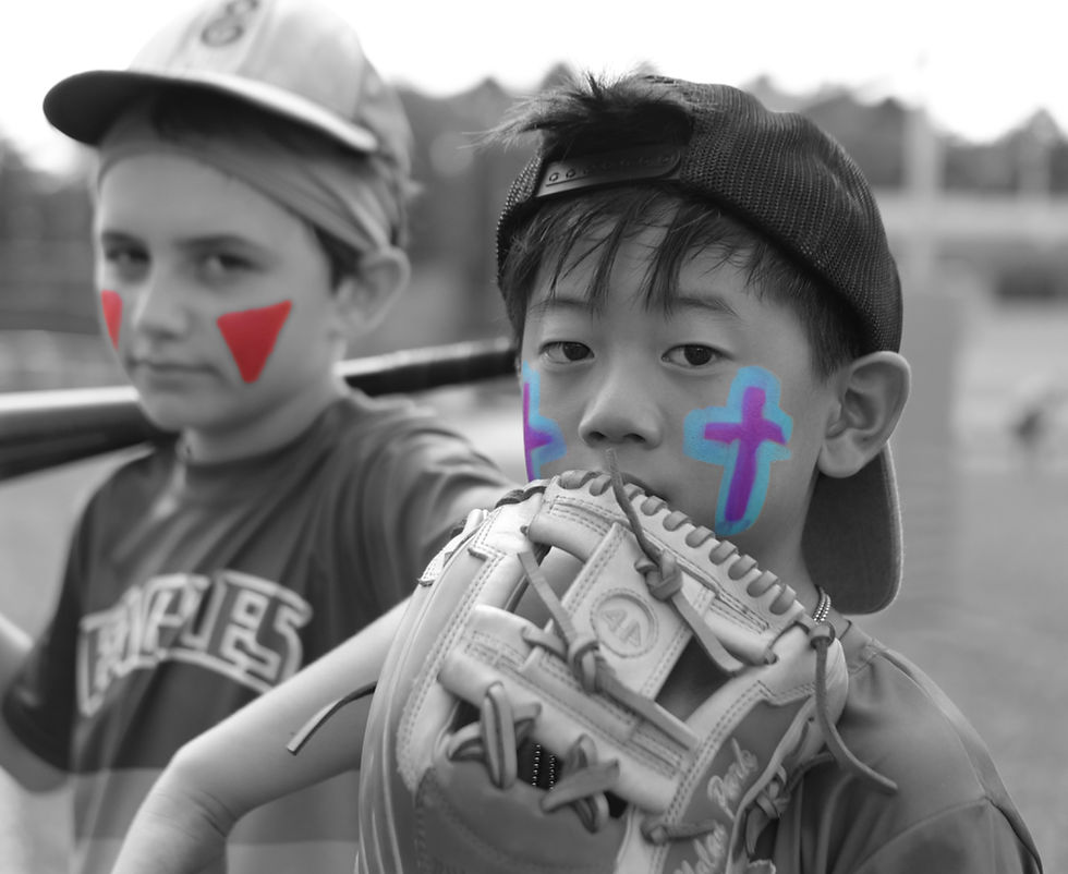
Game day style is not extra - it is part of how athletes show up. The best eye black designs for athletes do more than look good in warmups or team photos. They help cut glare, frame your face, and bring a little edge to the way you compete. When your fit is locked in and your gear feels right, your confidence usually follows.
That is why eye black has shifted from a basic swipe under the eyes to something way more personal. Athletes want performance, but they also want drip. They want something that holds up through sweat, feels comfortable on skin, and looks intentional instead of messy by halftime.
Why eye black design matters
A lot of players grew up thinking eye black had one job - reduce sun glare and call it a day. That still matters, especially in outdoor sports where late afternoon light can wreck your vision. But design matters too, because athletes are not robots. They care how they look when they step on the field, and there is nothing wrong with that.
The right design can change your whole game-day energy. A clean look can feel sharp and focused. A bolder shape can make you feel more aggressive and ready to attack. For younger athletes especially, style is part of identity. Teams have traditions, players have rituals, and eye black sits right in the middle of both.
There is a practical side here too. When eye black is applied with intention, it tends to wear better and look better for longer. Random smudges can turn into a sweaty mess. A defined design usually stays cleaner and photographs better, which matters when every tournament weekend ends up on somebody's camera roll.
The best eye black designs for athletes start with the sport
Not every design works for every athlete. A baseball player standing in direct sun for nine innings may want a classic, functional stripe. A soccer player might want something lighter and more flexible that still looks bold after constant movement. Football players often lean toward heavier, more dramatic styles because the sport already has that intensity built in.
That is the trade-off with eye black designs for athletes. The more detailed or creative the look, the more effort it can take to apply cleanly and maintain through play. Simpler designs are easier, faster, and usually safer for long tournament days. More expressive looks can hit harder visually, but they need better application and a little more confidence to pull off.
Age matters too. Younger players often want something fun but easy, especially if parents are helping them get game-ready. High school and college athletes may care more about matching team colors, standing out in photos, or building a signature look. There is no single right answer. The best design is the one that fits your sport, your vibe, and your routine.
Clean looks that always work
Some eye black styles never miss because they are simple, athletic, and easy to wear. The classic under-eye stripe is still the go-to for a reason. It gives you coverage where you need it, looks tough without trying too hard, and works across almost every outdoor sport.
A slightly thicker stripe gives more presence on the field and tends to show up better from a distance. That can be great for athletes who want a stronger visual look without doing anything too complicated. A thinner stripe feels cleaner and more modern, especially if you want something sharp instead of heavy.
There is also the angled stripe, which adds a little motion to the face. It feels faster, more aggressive, and a little more styled than a standard horizontal line. If you want just enough personality without going full custom, this is usually a strong move.
Bolder designs with more personality
Some athletes want more than a stripe. They want a look. That is where shapes, extended wings, layered color, or graphic placement come in. These designs can bring real energy, especially for rivalry games, playoffs, tournaments, and themed team events.
The key is balance. A bold design should still read as athletic, not chaotic. If both eyes have completely different shapes or the application is uneven, the look can fall apart fast. Symmetry matters more than people think. Even a creative design looks better when it feels intentional.
Color changes the whole feel too. Black is classic because it is clean, strong, and versatile. White pops harder in photos and can feel fresh, especially with darker uniforms or night games. Team colors can make the look more personal, but not every color gives the same contrast or impact. Some shades look amazing in the mirror and disappear once you are out in direct light.
That is one reason modern products have changed the game. Athletes are not just looking for pigment. They want options that let them create cleaner lines, stronger shapes, and more individual style without sacrificing wear.
Performance still comes first
Style is fun, but if your eye black starts melting by the second half, the design does not matter anymore. Sweat resistance, skin comfort, and easy application should be part of the decision from the start. This is gear. It just happens to look good too.
The skin under your eyes is sensitive, so texture matters. If a product feels too greasy, too dry, or too irritating, you are going to notice it fast. That is especially true for athletes who are already dealing with sun, dirt, sunscreen, and constant wiping during games. A product that sits well on skin and stays put under pressure is always worth more than one that only looks good for ten minutes.
Application matters just as much as formula. Cleaner tools usually mean cleaner results. If you are trying to build a specific design, you need control. That is where products with more than one application option can make life easier. A wider swipe may be perfect for a classic stripe, while a more precise edge helps with detail work. Starr'd Athletics built around that exact idea - think eye-black but better, with style and performance in the same lane.
How to choose a design that fits your face
Face shape changes how eye black reads. If you have sharper features, a bold straight stripe can look especially strong. If your features are softer or rounder, an angled or tapered shape may frame the face better. The goal is not to follow beauty rules. It is to choose a design that feels balanced and confident on you.
Your eyebrows, cheekbones, and the natural width under your eyes all affect placement. A stripe that sits too low can drag the whole look down. Too thin, and it may get lost. Too thick, and it can overpower your face, especially on smaller athletes.
This is one of those areas where testing before game day helps. Try the look in natural light, not just a bedroom mirror. Take a quick photo. Move around. Sweat a little if you can. The design that looked perfect standing still might need a slight adjustment once you actually put it into motion.
Team style versus personal style
There is always a little tension between team unity and personal expression. Some coaches love matching game-day details. Others do not care as long as players are ready to compete. If your team has a shared look, eye black can help create that unified energy. Matching stripes or team-color accents can make everyone look locked in before the first whistle.
But personal style still matters. The best team culture usually leaves room for athletes to feel like themselves. Maybe everybody wears eye black, but each player chooses the thickness, angle, or color combo. That keeps the look connected without making everyone feel copy-pasted.
Parents play a role here too, especially with younger athletes. A simpler design is often the smart choice for busy mornings, travel days, and back-to-back games. A cleaner routine means less stress and fewer touch-ups. If your athlete loves style but still needs speed, start with one reliable design and build from there.
Make it part of your routine
The best game-day details are the ones you can repeat without overthinking. Eye black should fit naturally into your prep, right alongside sunscreen, hair, hydration, and warmups. If it feels like a hassle, you probably will not stick with it.
That is why the smartest move is to find one or two signature looks. Maybe it is a clean stripe for regular games and a bolder version for bigger moments. Maybe it is black for serious matchups and a team-color accent for tournaments. Once you know what works, getting ready gets faster.
There is also something powerful about having a consistent look. It becomes part of your presence. Teammates recognize it. Opponents notice it. You start to associate that design with locked-in focus, and that mental switch matters more than people give it credit for.
A good eye black design does not need to be flashy to hit. It just needs to feel like you - ready, confident, and built for the moment. If it helps you see better, feel tougher, and show up with more edge, that is not just style. That is part of your game.


Comments